
9 Tricks to Turn Dry Content Into Irresistible Reading
We’ve all been there. A massive document slams into your desk or inbox and rather than read it, you seriously consider poking your eye both your eyes out. Let’s both promise to let this never happen again – by making our own content zip bang good-looking! (Ahem, that was in fact my feeble attempt to gently point a finger at you for creating dry content. Will you forgive me?)
With 16 years as a visual designer under my belt, I’d like to share my favorite nine tricks for turning dry content into irresistible reading.
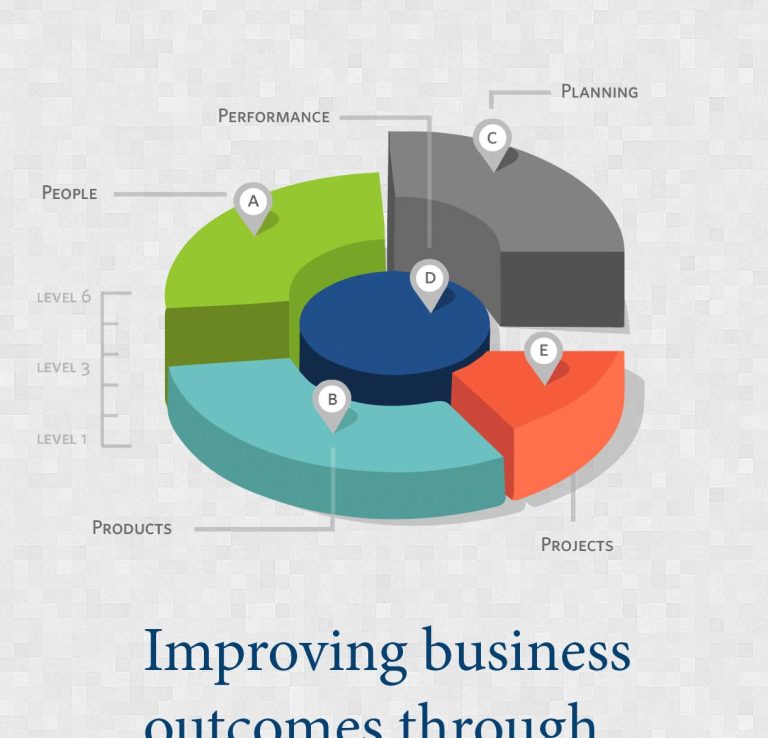
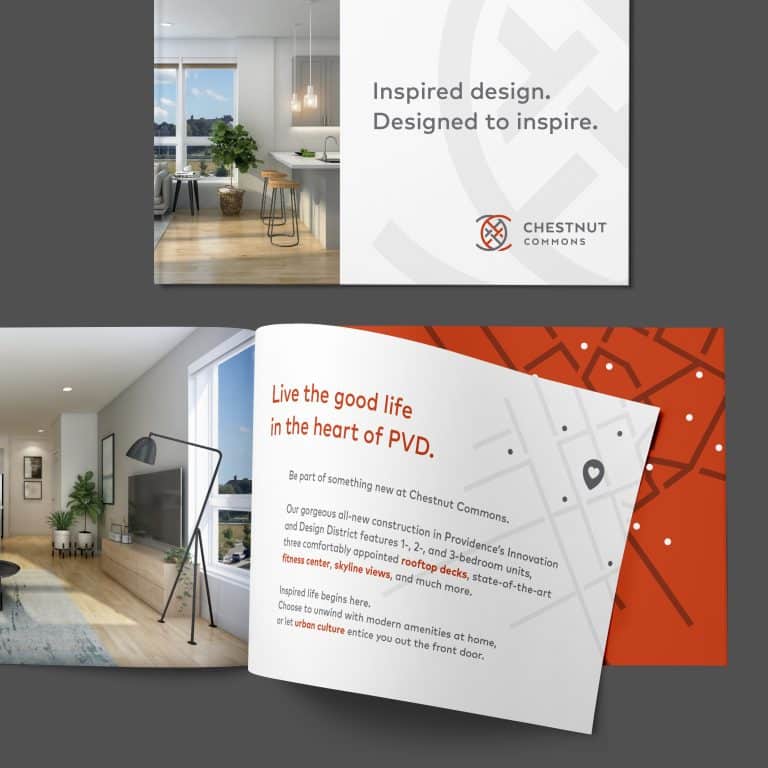
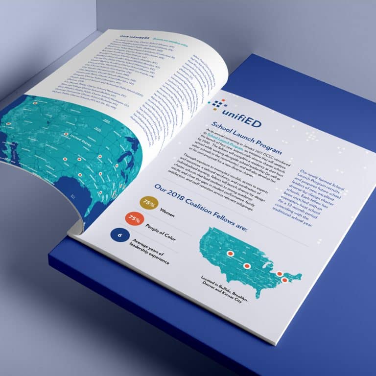
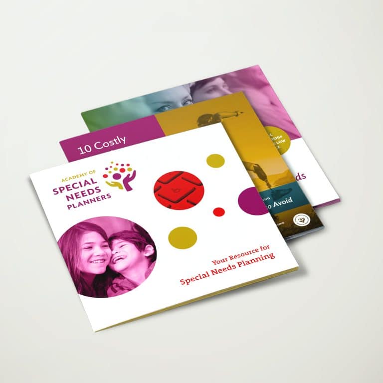
Use these tips to snaz up:
- Power Point Presentations (or any ol’ presentation)
- Annual Reports
- Blog Posts
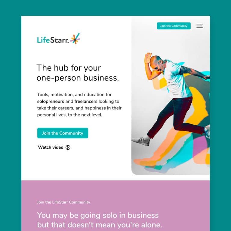
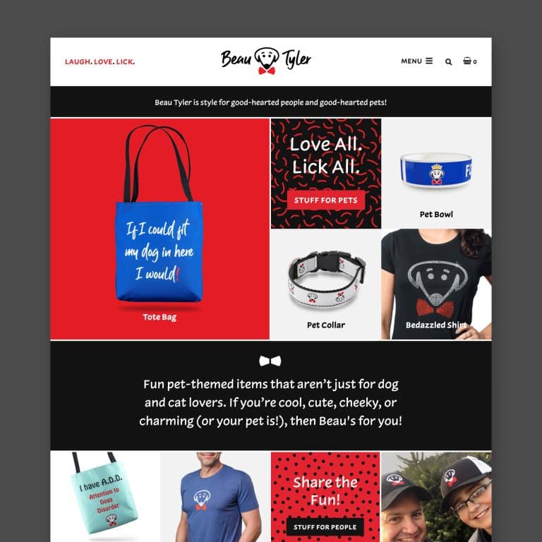
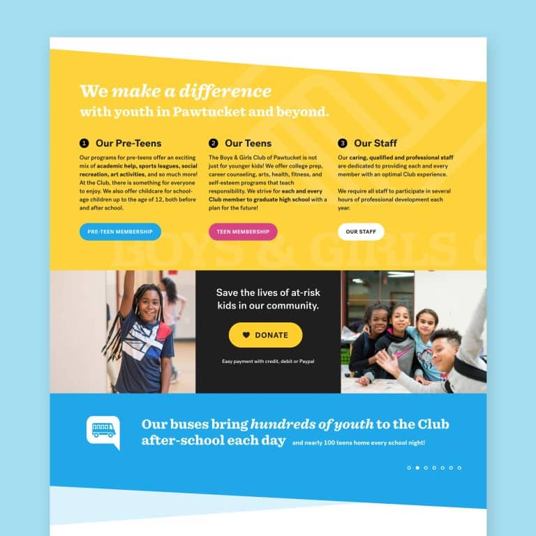
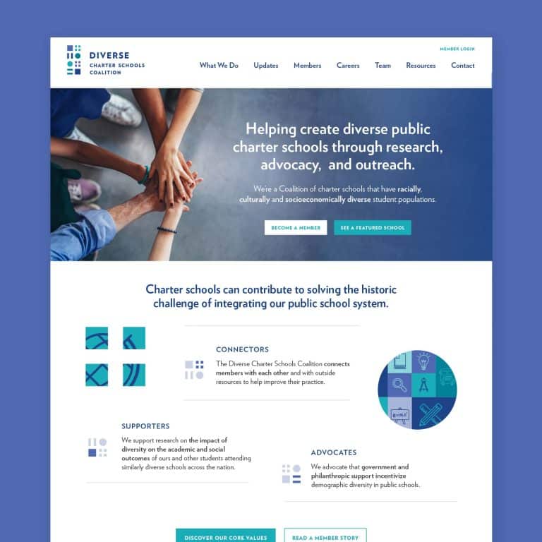
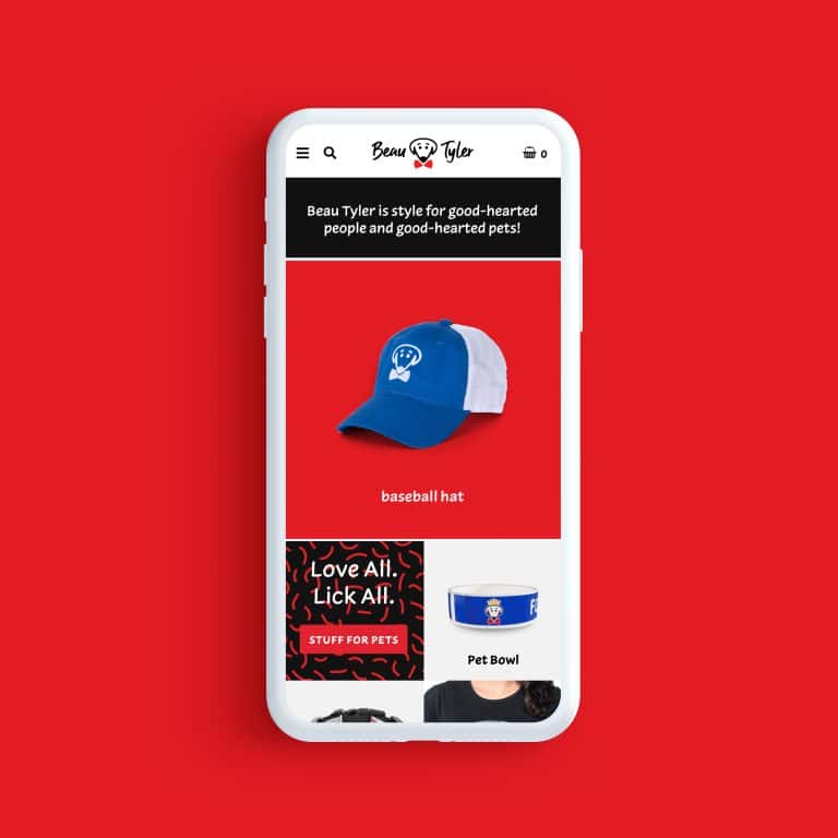
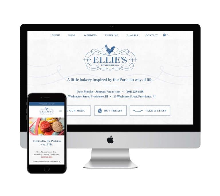
- Web Pages
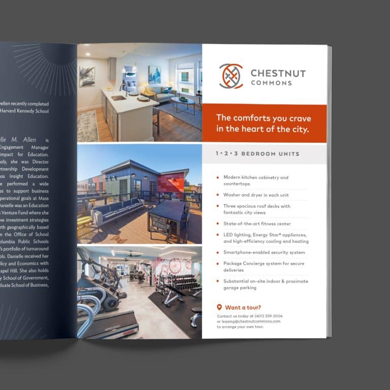
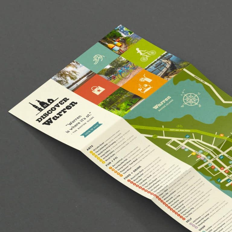
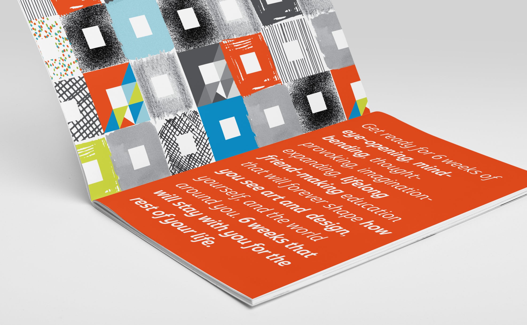
- Brochures
- eBooks
- White Papers

3. Be Bold
Draw attention to unusual or essential content by bolding a title, subheading, or even part of a sentence. You’ll notice from reading this post of mine that I like to bold certain words or phrases in a paragraph to both encourage reading and drive a point home.
tipThe trick is to use bolding sparingly so the effect does not lose its power.

4. Create Breaks
Paragraphs break up long chunks of content into digestible bites. Eyes have an easier time finding where they left off with frequent paragraphs.
They also help gather ideas, signal to readers that a shift is coming, and create momentum by making every finished paragraph feel like an accomplishment.
tipIncreasing the paragraph leading (the amount of blank space between lines of text) to anywhere between 1.3 and 1.6 (130% to 160% of the default leading) also helps makes larger paragraphs easier to read.
5. Action Words
Unusual verbs add a sizzle to the English language that grab attention and inject passion into your writing.
Did that sentence grab our attention? Or did it get your attention? Did it inject passion? Or add passion? My secret tool: Thesaurus.com.
6. Dig for Details
Vague explanations and descriptions leave us yawning. Be specific! Details we can dig our nails into engage so much that we just keep reading. Take time to uncover those details, like the waitress’s name, the exact amount she paid for her first retail lease, or the title of the book he read over and over that revealed his destiny.
tipWhen it comes to creating this content, it can sometimes feel like you’re back in college with that unwritten term paper looming over you. If you know you won’t be able to hone in on the important details all by your lonesome, maybe it’s time to bring in the bug guns – by that I mean a copywriter and/or a marketing strategist. I know a few that could help!

7. Tell Stories
Banging readers over the head with “do this, then do that” is not going to win you any friends (just like me telling you to eat salads to lose weight). But telling stories about people is a fabulous way to grab your readers’ attention and keep it. Why? As humans, we have an enduring interest in the fate of other humans, their successes, snafus, and moments of truth. In other words, share your experiences and the experiences of others as a means of teaching the end lesson (and simply sparking interest in your service or product). (Scroll to the top of this post – see how I launched this post with a mini story?)

8. Bigger Text
Studies show that the bigger the text on a website, the longer users stay on the website. I’m not recommending a 35 point size for every word. But let’s make it easy on the eyes, and not use anything smaller than 14 point, okey dokey?
A good trick to see if your text is at an easily readable size: squint your eyes a little – can you still make out the letters and words? If not, maybe it’s too small.

9. Compact Columns
When your eyes have to read across the entire width of a page or screen, it can be a bit rough on them. Jumping back to the next line is easier when the columns are narrow. You’d be surprised how this can turn dry content into text with a lot of momentum. Shorter single columns or double or even triple columns can work wonders and break up content well for your readers.
I hope you’re able to incorporate some or all of these nine tricks to make boring content engaging and fun to read. If you’re looking for professional help with graphic design, feel free to check out my work or sign up to receive my ‘Getting Started’ guide below.
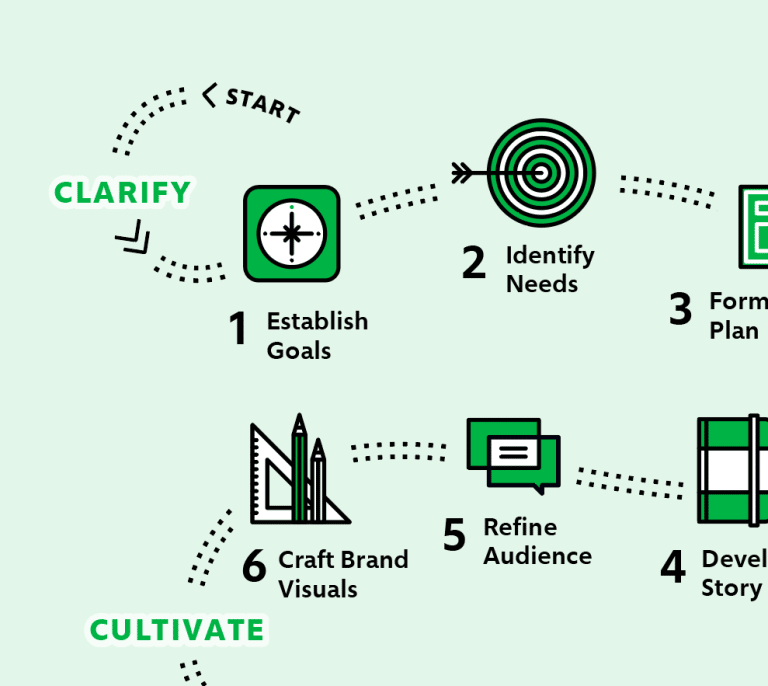
It's hard to market an unfocused brand.
Your business must tell a powerful story with strong optics and a persuasive storyline so you can stand out from the crowd and change more minds. Get a brilliant visual framework tailor-made for you.


